Global warming over the next century means that species will move (animal migration will occur) to cooler climates, but manmade barriers often stand in the way
Climate change is turning out to have a damning effect on living conditions for people, and scientists suspect that it will be the driver of mass human migrations. Just last week, an Alaskan village of 600 people held a special vote on whether to leave their island amid threats of coastal erosion. Extreme weather events – like the historic flood in Louisiana and persistent wildfires all over the U.S. – have also forced people out of their homes.
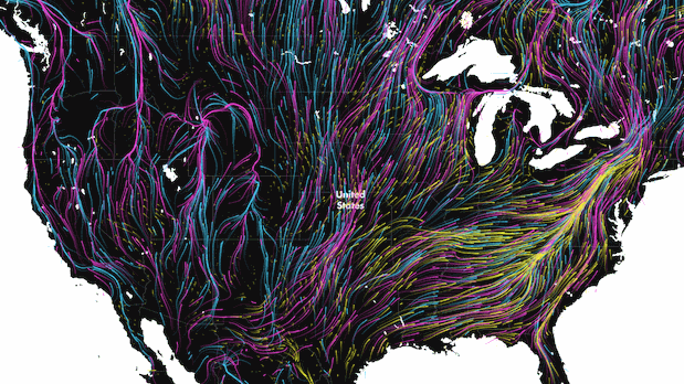
But humans aren’t the only ones affected by rising temperatures. Nearly 3,000 species of animals in the Western Hemisphere alone will have to find new habitats with more preferable climate conditions by the end of this century, according to a stunning new map by cartographer Dan Majka for the Nature Conservancy.
Called “Migrations in Motion”, the map outlines how species will move from their current habitats to their new ones while avoiding major manmade and natural barriers. Pink lines indicate the movement of mammals, while the blue and yellow lines represent the migration of birds and amphibians, respectively.
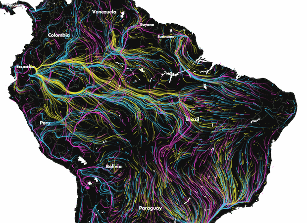
The map draws on data from a 2013 study that looked at climate models and data on how human modification of the landscape to project the movement of 2,903 vertebrate species in North and South America. The researchers plotted the direction of each species’ migration route so that it avoided areas that have been heavily affected by humans.
Routes are also based on flow models of the “electric-circuit theory.” The idea is that more pathways result in more flow, while fewer pathways can lead to constraint and bottlenecks, says Brad McRae, a senior landscape ecologist at the Nature Conservancy who coauthored the study and who worked with Majka on the map.
So many species meant a lot of numbers to crunch into an understandable visualisation. Majka took inspiration from what he calls “one of the most compelling interactive visualisations of our time” – Fernanda Viegas’s and Martin Wattenberg’s wind map of the U.S, which was eventually adapted to depict the real-time wind patterns across the globe.
“Following in their footsteps, we thought it could be a compelling way to visualise a large amount of directional data,” Majka tells CityLab in an email. The result is an incredibly detailed simulation of animal migration through North and South America, with lines snaking in every direction.
“Where you have more lines or faster lines, that means you have a lot of things converging and trying to move through that area,” McRae says, adding that the model uses resistance to show how it’s easier for species to move through natural landscapes than through developed areas.
Zooming into the U.S., it becomes apparent that the lines become longer and denser along the East Coast. McRae says part of the reason is that the East Coast lacks a “strong elevation gradient,” which means species have to move further to reach cooler climates (whereas in the West, species can migrate up hills). Another reason, he says, is because the East is heavily developed, so animals tend to beeline into the Appalachians to find cooler climates.
In a separate study published this June, McRae and his colleagues looked at the effect of manmade barriers like roads, farms, and urban infrastructure on the the fragmentation of natural landscapes in the U.S., and how that affects animal migration. They found that overall, only 41 percent of natural lands in the U.S. connected enough for animals to move through. On the East Coast in particular, just two percent of natural lands are sufficiently connected.
“By presenting the data with a flow map,” Majka says, “we’re able to easily see large-scale patterns like the importance of the Appalachian spine and Rocky Mountains for allowing species to move up in elevation and up on latitude toward cooler climates.”
As detailed as the map seems, McRae points out that this is still a very coarse depiction of migration patterns, based on 50-by-50-kilometre grid cells. It paints the big picture of animal migration, but to really understand local patterns – and where a particular area needs to improve its natural-landscape connectivity – there needs to be more research.
McRae says cities play a key role. “Cities are a lot more sustainable in many ways than having population spread out on the landscape,” he says. “There are a lot of efficiencies to be gained in transportation and energy use and just the footprint that an individual household (leaves behind).” He adds that the Nature Conservancy is also looking at ways that underpasses and overpasses, as well as green spaces on rooftops, can help animals move through a city.
“The bottom line is that species will need to move or adapt, or die,” he says. “We’re hoping that these maps will help people realize that we need conservation efforts – not just preserving habitats in isolation, but keeping everything connected.”